Friday 16 August 2013

The Exhibition

So, lastly, I come to the matter of how I have chosen to show the book. First, I should make clear that the gallery is not a natural space in which to encounter a mass-produced artist's book. My work generally exists in a very different conceptual framework to the white cube gallery, and indeed a wish to escape the white cube was one of the things that lead me towards making books.

In order to try and make the book fit in to the exhibition, I knew I would have to play with the normal expectations of the gallery. The book is intimate; it is normally understood in the context of its relationship with a single reader; their body, their hands, their eyes, their subjectivity and so on. Even if a book is shared, it is generally through one person to a wider group, as in reading out loud. The white cube gallery, on the other hand, is the complete opposite of intimate; it is clinical, conceptually sterilised, the whole aesthetic designed to seperate the audience from the artwork, and the artworks from each other, creating critical distance. This is not what I need for my work.

My ideal choice would have been a small room which I could appropriate as my 'reading room', allowing people to enter in, perhaps through a curtain, to a completely seperate space, with walls and floors completely at odds with the gallery. Perhaps carpeted floors, or wood panelled walls?

I suspected however, as soon as I took a tour of the space in which we would be operating, and when I understand the requirements of other students, that I would not get a seperate room. Indeed, I was given a space that occupies one corner of a larger space; it was obvious that I would need to take dramatic measures to make this space my own. So I channelled my inner Ilya Kabakov and got to work.

Since the white cube is, in some ways, a Utopian conception, it made sense for me to create a Dystopian area within it. This was also suggested to me by one of my greatest fears, with regards to showing the book in a gallery; that people would treat it as sculpture, and not pick it up and read it. There were obvious measures I could take to prevent this; I have noted that the book can be read in the catalogue, and I have requested a small notice to be added to the label to the same effect. Another methodology that I hit on, fairly obviously, was to create propaganda posters that might imply the same message. To that end I created two posters, that would be wheat-pasted within the space.

For the decor, I decided to go as diametrically opposite from the white cube aesthetic as possible; scuffed wooden furniture, dirty floor, grimy, dented and crudely painted green walls. The particular colour I chose for the walls is a nod to my own previous work, as the shade (Wilkinson's 'Oak Green' matte emulsion) formed a large constituent, along with a couple of greys, of the paint used on my 2011 piece The Emerald Tablet, techniques learned from which I have employed extensively whilst creating the exhibition space. It is a pity that I do not have an extra week, and much more money, or I could have made a serious go of making the walls of the space resemble weather-damaged concrete. As it stands, I contented myself with a deliberately slap-dash paint job, carefully painting patches over patches with a brush by hand to achieve the desired effect, and with the employment of a liberal amount of the same mixture of flour, mud and hot water that I once used to dirty the tablet. The dirt also provided a solution to seperate off the floor from the rest of the gallery, using a thin black line and liberal amounts of dirt.

The furniture was a hard decision, and one unfortunately constrained by time, money and lack of proper transport. I think the utilitarian wooden furniture is satisfactory, however, and approaching the best solution, though I would prefer a slightly plainer chair. Metal or plastic furniture would have suggested the institutional too strongly for an exhibition being held on a University campus, making the audience think I had simply stolen furniture from a classroom. This would have ruined the theatrical effect. 

One idea that I had been rolling around in my head for some time was to display my final book alongside others. I had initially considered lining up all my own books, but this would have required an entirely different concept and method of presentation. Instead, I chose books from my own collection, narrowing the final choice down by considering both the aesthetics of the books as well as their contents. Though I have included some obvious works (The Republic, Utopia, 1984, Brave New World), I have also included some books with a more oblique significance to the core topic, but that have personal meaning to myself, such as a script for Dylan Thomas' glorious celebration of humanity Under Milk Wood and Olaf Stapledon's beautifully strange metaphysical science fiction novel Star Maker. I have gone for books that look, to some lesser or greater degree, used and somewhat old-fashioned, tired out like the rest of the setting. The only author featured twice is Ursula K. LeGuin; the short story collection is included solely because it contains the stunningly powerful parable about the cost of a perfect world The Ones Who Walk Away From Omelas.

The other features of the space were matters of serendipitous risk-taking. I saw the large no-smoking signs for sale at the place where I got my posters printed. Once I had it, it was natural to include the mockingly over-filled ash-tray underneath it. This suggested a subcurrent of rebellion. I underscored this by scrawling the phrase 'Bored Mindless Here in Utopia' from the Hawkwind song Arrival in Utopia, which is quoted in full in the book, thus tying the book and the space together.

The condom was just to increase the general grot. It is, I promise, not used.

Utopia/Dystopia: Critical Review and Analysis

Personal reflections

Utopia/Dystopia was an extremely challenging project for me. It is important for me to understand why, in order to continue to develop my practice as I move beyond my MA. There were several points throughout the entire process when it was not clear to me that I would be able to complete the project within the allotted deadline; that I have managed to achieve this has only been because of extremely hard work, concentrated into an uncomfortably short period that has had a negative impact on my personal life and relationships, not to mention my mental health. This is not good practice; certainly it is not sustainable practice. These problems also impacted my work; I fell out of good habits (such as the keeping of a regular blog) that I had developed through Vectis, thus leaving this portion of the unit underdeveloped. Once I had reached a certain point, time-wise, I felt unable to even think about this blog whilst the book itself remained unfinished. This problem of time management arose from my inability to get to grips with the project in a timely enough fashion. After the intense work, and the success, of Vectis, I found myself in a position where I was, basically, suffering from writer's (or artist's) block. The subject I had chosen was rich, but it was also incredibly vast; I had difficulty finding my entry point, or in deciding on a structure that I could use to organise the work. With Vectis, I had been able to, relatively early on, make the key decision that the work would be structured after the solar year; once this overall structure was in place, the rest of the book developed organically; although the quantity of the work that I had to undertake was daunting, I knew, from a fairly early stage, precisely what that work was to be, and was thus able to plug away at it with a good degree of vigor. With Utopia/Dystopia, I found myself, essentially, paralysed by a lack of organisational structure. I found myself making a number of false starts, some of which can be found on this blog, which sucked away time. The empty pages of the book became, not an inviting prospect for work, but instead an intimidating blankness. The more research I undertook, the more I read and thought about the subject, the more I developed my various thoughts, the more things seemed to fall apart. That I was able to rescue the project and complete the book from this state is a personal achievement of which I feel proud, though to avoid such a state in the future would be the most ideal outcome.

One aspect that I have to consider is the simple problem of the incompatibility of my working methods with the structure of a degree. This has plagued me throughout my career in higher education, though throughout the third year of my BA and during my MA I have managed to overcome this incompatibility, mostly through hard work. My main problem is that I have a tendency to work constantly, but sporadically when considered from the viewpoint of a single project. I like to work intensively for a while on one thing, then switch to another thing, then come back to the previous thing with fresh eyes for a while, then move on to a third thing for a bit, and so on. This is a consequence both of my personality and the breadth of my practice, and I am constantly unsure as to whether it actually represents a problem, or whether it is simply something that, in my future career, I will have to take care to manage. It was definitely a problem during Utopia/Dystopia; I had a brief spurt at the beginning of the project, then for a long time, whilst I was reading around the subject, I wanted to do almost anything else but work on Utopia/Dystopia, and generally found it extremely difficult to make any inroads. Almost all of the material that actually appears in the finished book was created in three months of intense work, and I do not consider it 100% perfect. This is true of all my work to date so far, however.

Since I have been so unforgivably neglectful in properly documenting the process through which Utopia/Dystopia was created, I will use the next few entries in this blog to detail the thinking behind some of the decisions that I have made, both about the book and about the presentation of it in the degree show, Denouement. This post will serve as a contents list, and will be postdated to be at the top of the blog once everything has finished being posted; originally I was intending all this to be in a single entry, but it is extremely long, and I thought it best to break it up.

Thursday 15 August 2013

The Contents of the Book

The development of the structure and aesthetic considerations of the book moved, necessarily, hand in hand with the development of the content. Each, indeed, informs and directs the other two. In some senses, it makes little sense to talk about them separately, except to avoid an over-long, rambling and unnecessarily complex stream of verbiage. 

It will be necessary to consider the matter of content section by section. First, this seems as good a time as any to discuss the matter of DS Blake. Mentioned briefly already on this blog here, DS Blake is one of the aspects of the final book that I have the least confidence over; I have included and excluded him several times, and still harbour doubts both about his necessity, and the strength of his execution. DS Blake was originally created as a simple pseudonym, in order to separate my work as a 'fine' artist from my forays into speculative illustration; much as 'Idle Toil' creates a degree of separation between my work in a commercial capacity and my work in a conceptual capacity. The intent was not to hide the fact that I am interested in science fiction, fantasy and horror out of a sense of embarrassment, but simply to acknowledge the distinct strands of my work, existing in different traditions and for different purposes. If I were to conceptualise my practice in terms of music, DS Blake would be a side project of the main band. The main practical purpose was to create two separate 'googleable entities' so that people searching for 'Simon Cardew Art' would not be confused by what they found.

The decision to bring DS Blake in as the fictional illustrator of Utopia/Dystopia came about during the struggle to locate an appropriate visual style for the illustrations in Heaven/Hell. Initially, I had a lot of trouble with this; my first thought was to continue the style embodied in the chapter headings; stark, heavy black and white. The expansion to include greyscale widened by possibilities somewhat; the first pieces of artwork that I completed that are still in the finished book are the images of the Utopian and the Dystopian that form, with newly coloured backgrounds, the centre of Culture/Nature.


The use of this particular style of semi-naturalistic digital painting suggested the style that characterises much of my work as DS Blake. The next images I created, the portraits that appear at the beginning of the non-visual essay sections, were an attempt to branch out into different styles, each portrait being rendered in a fashion suitable to the subject. However, this gave no inroads towards a visual style that would be appropriate for the majority of any illustrations that would be necessary. Since I already had a style I could use, I decided to bring in DS Blake, playfully crediting him as a co-author and creating a bizarre fictional biography inspired by underground culture. In the end, the majority of the illustrations I ended up creating for Culture/Nature were not distinctly those of DS Blake, and many of the illustrations for Magic/Politics were more distinctly those of Simon Cardew. In the end though, I still consider the claim of dual authorship appropriate, and I find the conceit enjoyable in any case.

Heaven/Hell

Heaven/Hell was the first section of the book, and the first section I began seriously working on. As previously noted, in the section on structure, very little of the initial outline actually made it into the final work. The use of the portrait of Blake at the beginning, and the extensive quotation of him at the end, is the ghost of this structure; at one point, a discussion of his work would have featured much more heavily. As it is though, I find it sufficient to suggest his influence. As can be guessed by my choice of pseudonym, I consider Blake (for all his faults, and he had many) to be in some sense the spiritual father to the loose artistic tradition of idiosyncratic British mysticism to which I would like to consider myself belonging, alongside other obvious touchstones such as the Pre-Raphaelites, Julia Margaret Cameron, William Morris, Alan Moore, Patrick Keiller, Iain Sinclair and Peter Christopherson. The fact that this tradition is so amenable to the subject of Utopia and Dystopia is no coincidence.

The subject of this first section became, eventually and perhaps necessarily, the development of Utopia and Dystopia as literary concepts, and some critical theory surrounding them, and their relation to history and to broader culture. The text itself is fairly un-cryptic, though the arrangement of the text, the choice of quotations, and the particular subjects covered are packed with allusive meaning. I had no choice but to be selective. The 42 pages of this section were in no way adequate space to deal with the subject in any manner that could pretend to be exhaustive; indeed, neither would the entire 230 pages of the book, or a book twice the size. I could easily have spent two entire years on nothing but preparatory reading and other research, and made this chapter into two fat volumes; time did not allow this. Instead, I followed what I have tried to make the guiding principle of the particular style of writing that characterizes the prose discourse in my books; to suggest and intimate, and to ask questions that may not necessarily be answered. Though there are some trappings of academic style, I do not intend this work to be seen as academic, nor does it make any pretense of the rigor one would expect of purely academic work at the post-graduate level. It is poetry, it is art. I try to make my writing playful, as much about the enjoyment of ideas as the ideas themselves. I hope to some degree I have succeeded. There are certainly ideas in this section that I did not encounter being expressed in my reading on the subject that merit further thought, from me or perhaps from someone else. The decision to parcel this section up into sub-sections, named after parts of the Divine Comedy, came early on, and I have tried to use it to inject a degree of tension into what might otherwise have been a rambling and unreadable stream of consciousness. 

The illustrations in this section are purely DS Blake, and the artistic thinking behind them deserves some discussion. In my digital paintings, produced under this name, my primary artistic influences are the German expressionist Otto Dix, and the pre-Raphaelites, particularly William Holman-Hunt. By using the capacity of the computer to zoom in and work on the smallest details with the same techniques and tools that one uses on larger areas (an utterly unique facility of the medium), the aim is to create a sense of 'hyperreality'; not necessarily in the strict Baudrillardian sense, but in the sense that the images are simultaneous more than and less than real; figures with subtly disjointed, cartoonish or expressionist proportions, and totally unreal landscape vistas are rendered in extremely fine detail, using vibrant and over-saturated colour. Some elements stand out as almost photorealistic, take for example, the cigarette and the spot in the cheek in the following image.

   
This image, particularly, stands out to me as succeeding with what I set out to achieve with this style, which is why I chose it for the catalogue image.

Culture/Nature

For this section, I decided on a complete change of tack, using a structure (as previously noted) that I previously used successfully in Vectis. Since I had explored Utopia and Dystopia in a literary aspect in the first chapter, I decided to explore the subject as a visual phenomena in this section. The textual essay is fairly straightforward and self-explanatory, as are the in-line illustrations. The simultaneous visual exploration of the symbolism used to denote Utopia and Dystopia, on the other hand, was an extremely difficult gestation. Finding a visual style for this section was extremely difficult. My initial decision not to run with the digital painting style used in Heaven/Hell was as much to do with a wish to vary my working practice somewhat and escape the computer; I decided instead to try creating some looser, hand-drawn illustrations. These illustrations, the styling of them, and their content went through an enormous number of iterations. Take, for example, four versions of the same picture, showing a slice of this development.


At first, I was attempting to produce a body of work in an array of hand-rendered styles. This was in keeping with the first body of work that I considered a part of the DS Blake identity, a personal project inspired by the cult computer game Dwarf Fortress. The over-wrought, gothic style of these illustrations, however, would have been over-much for the subject of Utopia/Dystopia. I tried a range of other approaches, experimenting with digital over-working of hand-drawn illustrations, but the results were never satisfactory. Eventually, I alighted on a very simple, iconic style, somewhat reminiscent of stained glass windows, which seemed suitable for the focus of the illustrations on exploring visual symbolism. Initially, I tried hand-colouring these with watercolour, but after a process of development, I alighted on block digital colour, combined with overlaid textures taken from photographs. 

At first, I planned on creating six illustrations exploring the symbolism of Utopia, and six exploring the symbolism of Dystopia. However, this never quite seemed to work out; the need for so many images spread the ideas too thin. Instead, I eventually decided on a sort of loose narrative sequence that explored the intermingling and mutual destruction of both concepts, ending in the obligatory mushroom cloud of apocalypse.

Magic/Politics

This section is looser than the other two similiar sections, both in terms of content and terms of approach. Initially I had intended this section to be fairly similiar to Heaven/Hell, though concentrating particularly on the politics and occult aspects of the subject. My first stab at it was the production of a fairly lengthy informal essay on the subject of conspiracism, reproduced here, as well as some tentative illustrations.


 This proved itself to be inadequate, and for a long time this section was basically abandoned as I worked on the rest of the book, being in fact the last part of it to be completed. When the right time came, it seemed almost to assemble itself. It is certainly the most cryptic section, as is perhaps fitting for its particular concern with the occult. 

The Visual Essays

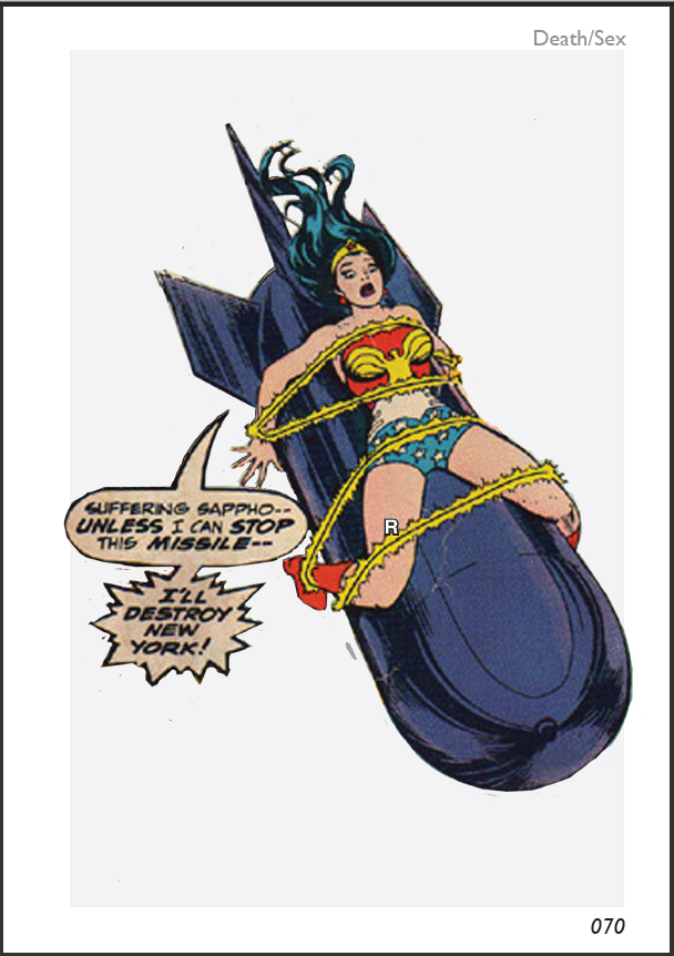
It is in the visual essays that the initial streams of consciousness survive. Take for example, this initial outline for Sex/Death:
Marquis de Sade. Pasolini. 120 Days of Sodom as a satire of intentional communities and utopian projects (specifically Rabelais)- The first dystopia? Sadean thought and Malthusianism; intimate relationship between sex and death in political economy.  Transhumanism. Critiques thereof. Donna Haraway. A Cyborg Manifesto. HP Lovecraft - cosmic horror vs techno-utopia.  80’s science-fiction literature and general culture; the intimate connection of the concerns of the time with nuclear apocalypse. Neuromancer. Blade Runner. Akira. The Japanese relationship with the legacy of Hiroshima and Nagasaki as expressed through science fiction, particularly with regards to mutation, birth defects etc. Eroguro Nansensu.  Contrast with the visions of the American ‘Atoms for Peace’ initiatives of the 1950’s: atomic cars, atomic jetliners, atomic landscaping; the visions of those who perpetrated the bombings versus those who had them perpetrated upon them. 
As you can see, most of the ideas bought up here end up in some sense in the final product. This holds largely true as well for the other sections, though Order/Chaos was written up from the beginning in more detail. Generally, the visual essays gave space for ideas that were outside the aegis of the other sections.

The actual layout of the visual essays; particularly the way in which the 'Note' section, the actual visual essay and the list of image sources reinforce and play off each other, is a formal experiment that I consider to be broadly successful. The essays play off the parallel formats, with each medium supplying information that it would be difficult for the other to supply. The most difficult of the essays to complete, naturally, was the first one, Sex/Death. Once the format had been established, the others were relatively easy to complete, though of course the selection of images presented some difficulties. With Sex/Death, this was particularly difficult as the visual essay portion was initially created from the short stream of consciousness above, after which the longer text was written after a long process of changing and re-ordering the images, a process made more lengthy by the cutting out process, which required detailed and careful work in photoshop. Overall, 77 versions of 44 seperate images were compared before the essay was complete.

The Design of the Book

The design of the book, that is to say, its aesthetic style apart from its content, was the part of the book that underwent the most development, and which gave me the most sleepless nights. 

The first major decision I made was motivated by problems I had encountered during the creation of Vectis. Namely, that the final book, though aesthetically and conceptually pleasing, was far too expensive to actually reach any audience. Using print-on-demand technology, each single copy of Vectis costs somewhere in the region of £65; were it to be a hardback (which is practically essential for a commercial work of this expense that is not an extremely specialised work such a software manual) that price would rise to nearly £80. The only way to bring this price down would be to set up presses to do a large run, or to contact a publisher. The first is (at least for the foreseeable future) financially impossible, the second presents me with ethical and other problems. 

Nearly the entire reason for the enormous cost of Vectis is the fact that it is in full colour, necessitating both vastly more expensive printing methods and more expensive paper compared to a black and white book. The cost per page for Vectis is about 7p; the cost of a page for a black and white book of comparable quality, on matter rather than glossy paper, is about 0.15p. Thus, from the beginning, I was considering how the costs of final printing of Utopia/Dystopia might be kept down. At first, I was considering the possibility of simply rendering the whole book in solid black and white. This design philosophy informed the creation of the first of the chapter title pages ('Sex') and ultimately all the chapter title pages, but I quickly decided that it would be restrictive for the entire book, though it would go on to have an extremely important indirect influence, as I will discuss below. First, I expanded myself to greyscale; then, as I began to think about how I might eventually display the book in my MA show, I hit upon the idea of designing the book so that it would function both in colour and in black and white, creating a commercial greyscale edition (which, in dustjacketed form, weighs in at a reasonable £12) and a more deluxe 'exhibition quality' colour work (which comes in at £45). This informed the design of the artwork and choice of colours throughout, and has been, I think, largely successful, although there a few parts that could do with tinkering.

Initially, I was considering an extremely spartan and conventional design, born out of the desire to make a 'proper book' for once. This seemed also to continue an arc that had been developing throughout my printed books, of a refinement and increased subtlety in design, developing through from the extreme eccentricity of What is a Book? through to Vectis (which dared to be actually readable) to this project. This early view of a page from Heaven/Hell gives some idea of just how conventional I was thinking in the first stages:


There was something pleasing about the simplicity; particularly, I was interested in how it gave me room to play with flatness and emptiness in a way that was impossible in Vectis, which had featured photographs, artwork and detailed, vivid backgrounds bleeding from the edge of every page. At this stage, seeing as I was planning on printing the work myself, I was specifically avoiding full bleeds, which have caused me endless problems on my (fairly basic) home equipment. The first major change I made to this format was the addition of a subtle grey box on every page:


The depth of the shade in this box gradually increased in intensity throughout Heaven/Hell, stayedd at one level for Sex/Death, then dropped back down again, undulating throughout the rest of the book, meant to help create a rhythm. This idea was eventually abandoned, with most of the books greys being scaled back to a 25% black CMYK process grey (perhaps the most beautiful 'pure' grey, to my eyes anyway), though there are points where this varies, either subtly or dramatically, for a range of reasons. Eventually, this box would be the backbone off which the entire book would be designed, but only after a brief, but important, diversion.

Thinking about designing an impressive book in black and white, and the concept of Utopia, naturally lead me, almost inexorably, towards the works of Utopian socialist, and master book-designer, William Morris. Leafing through facsimile editions of his masterworks, such as a the Kelmscott Chaucer, I fell completely in love (as I always do when I come back to Morris) and began to consider the possibility of doing something in a similar vein. I did a few experiments, combining decorative borders (actually taken from Morris's work, though I was intending at some point to design my own) with elements of my own style and some of the content, but it seemed to fall a bit flat, so I returned to what I had previously been doing.


Returning to the grey box, I began to think about what ideas I might take from the Morrisonian 'Book Beautiful'. I started fairly simply. with feaures such as the decorative initials, which were (for a very large part of the book's production process) much more elaborate.


Although subtle, you can also notice the first appearance of the white bars dividing the boxes here. I continued designing the book along these lines, adding and playing with content, for some time, but it remained always unsatisfactory; I knew that it was only a temporary solution, or the core of a better idea.

The first big breakthrough came with the decision that I was going to make a version of the book in colour. This suggested the possibility of adopting a colour scheme to mark out the different sections of the book, as I had done with Vectis. This was also the time where I made the decision to get the book printed commercially, thus opening up once more the possibility of full bleeds. The coloured tabs, which instantly became one of the most distinctive visual features of the book, arose naturally, though the final choice of colours for each section involved several days of pondering and twitching CMYK sliders.


In the above example, you can also see another design feature that appeared at this time; decorative white forms, blending into the background, taken from sections of the chapter headers. These never really worked, but some remained, albeit in even subtle form, for much of the process, finding themselves in the final book only in the form of the crucifix shaped word-clouds in the background of the timeline in Heaven/Hell. In a future version of the book, I might remove them altogether, but for the moment, they stand.

Throughout these early stages, beginning with the decision to introduce greyscale, I was also considering the knotty problem of designing the visual essays, particularly Sex/Death, which, being the first one I attempted (and the only one to completely use the cut-out style I developed), was the longest and most complicated to produce. The first iteration was simply the same as the text sections, but with images.


The letter R, overlaid over the image, was the reference for the page containing the image sources (the concept of using a different numbering scheme for each section only coming in, in a flash of inspiration, with the coloured tabs). I kept the images in colour because, at this time, I was considering that the visual essays might be special colour sections. The image source page itself was more spartan, though it certainly contained the seeds of its current form:


These sections changed little, until the design overhaul that revolutionised the whole appearance of the book, inspiring a massive spurt of work from me as my confidence in the final product increased overnight. The source of the change was the simple act of clicking a button to see what the ubiquitous grey boxes would look like with a black border. For a long time, I had been resisting the notion of solid borders, for reasons that are now not quite clear to me. For some reason, I worried that it might be crass, and tried to find some way of letting large, flat areas of colour and grey work together in a painterly fashion. The addition of the black border changed everything. Particularly, it caused me to start visualising the grey boxes as 'floating' above the coloured tabs, prompting the detail of the white lines across the page turning into separate little grey boxes, with the colour tab visible behind the join, which I still consider to be one of the most visually pleasing details of the book.


As you can see in the above example, the black border also made me think a lot more about the cut-out figures in relation to the grey backdrop, and prompted a lot of interesting play with the way that the figures either emerged from or broke through the borders, which help to make Sex/Death one of the more visually exciting of the sections, in my opinion. The only major change left to make to this section for it to reach its final form was the addition of a black border around the cut-out figures, the result of a successful 'what if?' aesthetic experiment.

With this basis laid down, the next major decision was whether to differentiate the various sections of the book visually, and if so how. In previous books, I have used dramatically different visual styles in different sections. In Utopia/Dystopia, however, I have decided to go for a more subtle variation in design, keeping features such as the sidebars and the central box consistent throughout, whilst changing other features. I have paid particular attention to the use of fonts. The fonts change subtly throughout the book, particularly the fonts used for large block of texts, though a consistency is achieved by the use of a particular weight of Helvetica (Narrow Bold) for all titles and other pieces of significant text, and the use of Gill Sans MT for the page numbers, in all sections except for Magic/Politics, where the use of the Babylonian numbering system required custom graphics. The rest of the book uses a considered mixture of Aparajita, Plantagenet Cherokee and Cambria for serif text, with Bodoni MT and Lucida Fax in specific applications (the names accompanying the portraits and the text of the image source pages respectively) and a careful assortment of Helvetica and Calibri in various weights for sans-serif. Experiments with more exotic fonts (various sorts of fraktur, blackletter and celtic typefaces) in order to evoke the Book Beautiful felt mis-placed and unsuccessful. The final design echoes various features of the Book Beautiful, but in clean, modernist garb. 

As the book moves through the three 'text' sections, the use of fonts, and the way text and image are balanced, changes with each section. In Heaven/Hell the images are separate illustrations to block text, and various Morrisonian features, such as decorative initials, are in full evidence. In Culture/Nature, the design becomes cleaner and more modern, and the structure mimics one that I used to good effect in Vectis, a simultaneous and inter-related but seperate system relating and opposing images and text, which I shall discuss in more detail in the section on content. This section uses sans-serif exclusively, and Magic/Politics mostly relies on this text, though used more creatively. In that section, I have gone for a more fluid inter-relationship between text, image and decoration, that fits in with the more esoteric subject matter of this section. This section also breaks somewhat with the principles of colour established in the other sections, where the scheme is dominated by the sidebars and a second colour derived from the sidebars, though it reflects the general colour scheme of greys and pale pastels. The visual essays follow a much more consistent pattern, though there is a degree of development. The first essay, Sex/Death, uses cut out icons, separated from their original context. The second essay, Drugs/Religion, uses complete images, and the third, Order/Chaos, uses a mixture of the two, as well as introducing images that stretch across two pages.


The Structure of the Book

The first major decision that I had to make about Utopia/Dystopia was about the actual form of the book itself. At the beginning, I was considering a number of options, including the creation of two books (either as completely separate codices or bound together in a dos-à-dos fashion) one entitled 'Utopia' and the other 'Dystopia'; I was also considering putting two volumes together in one volume, in such a way that the book could be read starting from either the back or front, with some parts rotated 180 degrees in relation to others, ideas I had previously experimented with in some of my hand-made books (particularly the book-poem 'Lily'). However, as I read and researched, these approach seemed to me to be both facile and inadequate; it quickly became obvious that the observation that 'one person's Utopia is another person's Dystopia' was not merely a witty bon mot; in fact, the concept of Dystopia had arisen largely out of satire and critical re-interpretation of the concept of Utopia, and thus to separate out the concepts was meaningless, and did a disservice to the understanding of both.

So, I went in search of other structures. As previously stated, in my last book, Vectis, I used a structure that was taken from nature. This was appropriate to a piece that dealt with the natural world. Since Utopia/Dystopia dealt with works of fiction, it seemed like it might be a good idea to try and derive some sort of structure from a work of fiction. I looked at a number of works, including The Republic, Utopia and Gulliver's Travels, as well as works not obviously linked to the themes such as Don Quixote, Ulysses and 120 Days of Sodom but failed to find anything that seemed promising. The only remnant of these ideas that made it into the final work is the titles of the ten sections of the chapter 'Heaven/Hell' which are named after the circles of hell and heaven in Dante's Divine Comedy.

The idea for the current section titles came when I decided that Utopia/Dystopia, which had up until that point been a working title, would serve as the final title. This false dichotomy, along with some of the directions my thinking had been taking, suggested the division into sections with similar names. Just as the distinction between Utopia and Dystopia was unclear, so I wanted the distinction between the others to be unclear. At first, they seem to suggest a very definite, black and white view of the universe, with one set of concepts (such as Sex, Heaven and Order) associated with Utopia and the other (such as Death, Hell and Chaos) associated  with Dystopia; however, the slippage between the two concepts in the title suggests a slippage between the other concepts as well, and this is further suggested and explored constantly throughout the book, in both subtle and obvious ways. The order, number and names of the sections was subject to change until fairly late in the project; at first, the section entitled Order/Chaos did not exist, and there was a section entitled Art/Science. At this stage, the book was ordered into six chapters:

Heaven/Hell
Sex/Death
Drugs/Religion
Magic/Politics
Culture/Nature
Art/Science

With Sex/Death and Culture/Nature being visual essays (the decision to explore this form in more depth was one I had taken early on). As you can see, this order is somewhat different from the finished article, as is the contents. The first thing I did, once I had written out this scheme, was begin to write a stream of consciousness to guide the research and content creation for each section. This is the stream for Heaven/Hell:

Utopia as a concept. Thomas More. Atlantis. Connecction to the Christian concept of Millennialism. Requirement for apocalypse. The Antichrist. Hassan I Sabbah. Similarities between the legends of the Hashashim and Al Qaeda. The Power of Nightmares – Islamic terrorism as a convenient myth. Evidence of a Manichean worldview. Christian dialogues of the eternal war of good vs. evil. William Blake-Visionary, book design. Jerusalem.  Christian intentional communities. Diggers. Branch Davidians. Conspiracy theories, as further expression of the Christian apocalyptic worldview. Satan as the ultimate conspiracist. Protocols of the Elders of Zion. The political utility of conspiracy theories via the enablement of demonization. Nazism, the roots of fascism and its intimate connections to futurism. Futurist Manifesto.  Non-western visions of Utopia.
As you can see, this is extremely different from what actually ended up in the book, and gives some sense of how vast the subject I chose to tackle is.

Once I have decided on the general form of a book, the first thing I do is to lay it out in a very rough form in Adobe InDesign, to get a sense of the flow. Initially, I was planning on printing and binding Utopia/Dystopia myself (This proved impossible, and was, I think, always something of a pipe dream; honestly, it would require twice the allotted time of an MA unit to adequately undertake such a task), thus, my schemes for the length of each section were taking into account the physical structuring of the book. My first plan was for a book of 340 pages, with two 20 page long sections (consisting of separate quires of 5 sheets each, perhaps in a different paper) bookending a main section of 300 pages, containing 5 quires of 15 sheets, each being 60 pages. Heaven/Hell and Art/Science were to each have their own quire, and the shorter length of the Sex/Death and Culture/Nature sections would allow the break between Drugs/Religion and Magic/Politics to fall exactly in the centre of the book. I created a crude model of this structure to help me visualise the book. As I began to work on the book, and think about the structure of the fore and aft sections, this gradually changed to become a total book length of 332 pages, with 83 sheets arranged in two quires of 16 and thee of 17 sheets, before this general concept was completely abandoned. The final book is significantly shorter than this early version, the ideas contained within edited and condensed. Using a size of A5 pages (and A4 sheets) seemed natural given the printing technology on hand, not to mention my long-standing, nigh-on mystical love affair with the ISO 216 system of paper sizes, which I consider to be one of the most elegant and perfect things ever designed by humanity. As it turned out, practical considerations eventually forced me to have the book printed in the similiar, though subtly inferior, US Trade sizing. The conversion of the book to this size, however, was achieved by simply extending the coloured bars at the size of each page out a fraction, leaving the actual contents intact in A5 size formatting, which I considered to be a suitable compromise.

The process of refining this structure into the one found in the final book was, as previously stated, quite lengthy. The first major change was the addition of the Order/Chaos chapter. The first concept of this chapter bears no relation to what ended up in the book; it was originally intended to be a short chapter found directly in the centre of the book, between the Drugs/Religion and Magic/Politics sections, and to be distinct in design and feel from the other sections; building on the ideas of Vectis, I was considering a photographic record of two walks, arranged side by side, one considering my home town as a dystopia, the other as a dystopia, accompanied by a poem. This was intended to function as a 'palette cleanser' or intermission in the middle of the book, but the concept never quite gelled, and as the book developed further seemed to fit in less and less. Eventually, Order/Chaos was moved to the end, to function as some sort of coda, at the same time as the rest of the book was restructured. Art/Science was removed, and the chapter titles were re-ordered, with a commensurate change in which would be a visual essay and which something else. What this coda would actually consist of was up in the air for a long time. At one point, it was to contain an essay about the nature of digital art, intended to be allegorical towards the main subject, but it became clear that that subject was both too big and too unrelated to the central theme; instead, what I created will form the core of what I hope to be my first big post-MA personal book project, tentatively entitled A Technical Manifesto of Digital Painting. The decision to make Order/Chaos a visual essay was the last major change to the structure of the book, apart from the introduction of the 'spacers' containing the faded Utopia and Dystopia logos between the sections. These were derived from some of the book-structuring theories of Keith Smith, essentially functioning as 'internal endpapers' for each section, enforcing the fact that each is intended to be able to stand alone (though obviously they are strengthened by the others). For a brief while, I considered the possibility of binding each section, and the introduction and after sections, as seperate saddle-stitched books with their own covers, and placing them in a box so they could be re-ordered and read in any order (a slightly more conventional version of Marcel Deuchamp's Green Box) but decided against it; I also considered including numbers for each chapter and suggesting that a roll of the dice decide the reading order, a nod to Stéphane Mallarmé's Un Coup de Dés Jamais N'Abolira Le Hasard (A Throw of the Dice Will Never Abolish Chance) and also to the pleasing connection between Choose Your Own Adventure books and Jorge Luis Borge's concept of The Garden of Forking Paths, Borges being a recurring theme in my work. Eventually, however, I began to realise that the work would be stronger if it built on itself in a conventional way. Thus, the internal endpapers; initially, these only took up two pages between the chapters, but I realised that, when considering the book as a physical object being read, it would be more pleasing and significant to have to actually turn a leaf between each section.


Thursday 4 July 2013

Western Conspiracism

One topic that is of particular interest vis a vis the politics of Utopia and Dystopia, and its relation to the occult, that is to say, to magic, is what I will term ‘western conspiracism’, a particular term that I use in reference to the body of study that has been termed ‘western esotericism’, of which conspiracism is, in many ways, a subset.

Western conspiracism is a diverse body of beliefs, propagated through a vast corpus of books, films, websites, television and radio programs, magazines, newspapers, pamphlets, lecture tours and pretty much every other potential medium available to it. It is broadly Christian in character, manichean in worldview and paranoid in style. It has a long intellectual history rooted in medieval anti-Semitism and witchcraft panics, and in the traditionalist fringe of the counter-enlightenment. It concerns itself with a huge array of topics that includes, but is not limited to:
  • The hidden influence and agendas of secret societies, either real or imagined.
  • The existence of concealed ‘over-governments’ that secretly administrate the world, often with an occult character.
  • The existence of secret cults, including many prominent figures, that hold Satanic or Luciferian beliefs, and diabolical rituals (including human sacrifice, child abuse etc.) associated with these cults.
  • Monetary and banking conspiracies, often involving the secret ownership of organisations (including whole governments) by banks, often including explicitly or implicitly anti-Semitic overtones.
  • Hidden messages embedded in films, music, television etc. that reveal the nature of the conspiracy and/or exert subliminal control over the audience through scientific or occult means.
  • The falsified nature of various historical events, including the staging of fake space operations, ‘false-flag’ terrorist attacks, etc.
  • Concealed histories involving hidden artifacts, occult knowledge, sunken continents, notable figures, secret societies and so forth, with clues embedded in famous works of art, architecture and so on.
  • The secret poisoning or sedation of the population through fluoride, food additives, chemicals sprayed from aeroplanes, or other means.
  • The existence of concerted programs to suppress widespread knowledge of important scientific breakthroughs in areas such as alternative medicine, free energy, anti-gravity etc.
  • The secret assassination of prominent figures or of supposed whistle-blowers by shadowy governmental or by the over-government.
  • The origins, meaning and purpose of UFOs and the degree of official knowledge thereof (including phenomena such as alien abductions, crop circles, ancient astronauts etc.)

Sunday 26 May 2013

Heaven and Hell


Two title pages from Utopia/Dystopia. I am not dead. Watch this space.

Thursday 9 May 2013

Visionary Environments


What makes a visionary environment?

First it generally embodies in some way the principle of Gesamtkunstwerk, or 'total artwork'. It should not just be a building, realised using traditional methods, but should include the totality of its environment, often including landscaping and interior furnishings, if any. Visionary environments tend to blur the boundaries between sculpture and architecture, and between craft and art. At the very least, the term describes a work that transcends or transgresses, in some way, the accepted definitions of architecture, sculpture, land art etc.

Secondly, it seems to be generally agreed that it should represent the vision (if not the labour) of a single individual, and it should be sui generis, existing outside of the aegis of a wider artistic movement. Thus, art nouveau buildings such as the Watts Chapel, Castel Beranger and the Stoclet House, though apparently sharing many of the features of visionary environments, are generally not considered to be examples of the genre. Similiarly excluded is the tradition of folly building, as well as romantic architectural fantasies such as Strawberry Hill and Neuschwanstein Castle. We should perhaps question whether this is done on any sound intellectual basis, or simply reflects a not always accurate identification of visionary environments with untutored creators, working outside of the mainstream artistic tradition.

For, despite a strong association with naïve and outsider art, the creators of works recognised as visionary environments are not always lone eccentrics. Many of the works of the Catalan architect Antoni Gaudi (particularly the Park Güell and the Sagrada Familia) are often considered as part of the genre, as are the architectural works of the Austrian artist Friedensreich Hundertwasser. Both artists were formally trained and recognised as significant creative forces within their own life-times. We can, perhaps, gain a clearer picture of what is generally thought to constitute a visionary environment if we understand the reason for their inclusion. In both cases, their works are marked by extreme idiosyncracy, and give the appearance of a certain naïvete, eschewing traditional mainstays of western architecture (most notably symmetry and straight lines). Both had their own reasons for doing this, Hundertwasser's being the most interesting in terms of the subject of Utopia and Dystopia. Growing up as a Jew hiding as a Christian during the Nazi regime in Austria, Hundertwasser developed a particular understanding of, and detestation for, totalitarianism in all its forms. Seeing the importance that a certain sort of architecture (rigid, monumental, imposing, neo-classical) had for fascism, he developed the supposition that he could create a form of architecture that, by eschewing regular geometry and incorporating pre-existing features of the environment (such as trees, which he allowed to grow through the roofs and walls of his structures), could in some way discourage people's impulses towards totalitarianism, and disrupt totalitarian control of the built environment. If, therefore, we take the narrow definition, sometimes proposed, that visionary environments should not only represent one idiosyncratic vision, but primarily be created to satisfy a need created by that vision, Hundertwasser falls by the wayside.

This definition highlights one glaring art establishment omission from most lists of visionary environment creators: the German dadaist Kurt Schwitters who, in 1923, began the lengthy process of transforming large parts of the ineterior of his home into an artwork which he initially called 'The Cathedral of Erotic Misery', but which he later, and more famously, began referring to as the Merzbau ('Merz Construction'1). It is difficult to understand what it is precisely that seperates this work from examples such as Ferdinand Cheval's Le Palais idéa, except Schwitter's artistic credibility. Indeed, we could argue that the untutuored Cheval is actually a more astonishing, powerful and authentic creative force than Schwitters (we are allowed to make such arguments because there is a fairly good chance Schwitters would have agreed wholeheartedly).
Generally, therefore, we must note that the term 'Visionary Environment' contains the same problems as we have previously identified with the term 'Outsider art'. But what does all this have to do with Utopia and Dystopia?

Essentially, we can see the Visionary Environment as a concrete form of Utopia. The Utopian writer looks around themself, sees an imperfect world and writes a book in which it is better. The visionary environmentalist mixes a bag of lime mortar and gets cracking. Whilst this directness and passion may seem entirely admirable, however, it also serves to highlight, in a very dramatic way, the core problem of Utopia. The visionary environment is the vision of one person only, and very often it is only one person who will ever be able to fully and comfortably inhabit it. Everyone else is simply a spectator at best. The anarchist writer Marcel Proudhon famously argued that 'property is theft'; by this he chiefly meant land; and there is no more spectacular and absolute way of claiming ones ownership and utter dominion over a patch of land than creating a visionary environment within it.

Utopia, it seems, may be pretty, but it is also antisocial.


1Merz was a meaningless term used by Schwitters to describe his artwork, taken from a fragment of a cut-up newspaper used in one of his early collages , “Commerz und Privatbank. This the correct english transation would be 'Merce'

Sunday 14 April 2013

Dystopian Imagery

My collection of Dystopian imagery procedes apace, and continues to be added to:

http://pinterest.com/quietuus/dystopia/

I will start on the Utopian collection as well at some point, but I need to think of appropriate sources to use. There are very few movies and television programs that feature unambiguous utopias, though apparent utopias may also be ok for the purposes of purely visual research.

Even at this stage, there is a clear trend for imagery (facelessness, repetition, maze-like environments) and colours (drab, dark, washed out). More will surely continue to emerge.

Friday 5 April 2013

Update on progress.

On February 13th, I set myself a plan of action for the next month, none of the points on which have as yet materialised. This has been for a number of reasons, however, I still plan to enact all these points as building blocks towards the final project. I think, from now on, I shall do something that I should have learned from Vectis, and stop setting myself deadlines that may become an embarrasment in the future.

Wednesday 3 April 2013

Face of Tomorrow

Tinkering around on the internet this morning, I came across this image, presented as having been created by 'scientists', overlaying faces to find the average of various countries.


The way this image has been composited has some obviously problematic elements. The fact that the taboo against race mixing has been preserved by treating white Americans and black Americans as separate, whilst reducing the entirety of West Africa to a single face jumps out as a particularly egregious example. Some quick research, however, shows that this project was not done by scientists, and the image above is obviously assembled from a variety of sources, though all apparently by the same art, Mike Mike. A native of Capetown, currently living in Istanbul, Mike's website describes the project thusly:

It deals with notions of race, place, identity and belonging on both an extremely local level as well as on an impossibly ambitious, almost Borgesian, global scale. The project is an exploration of human identity as affected by the forces of globalization and makes full use of all the tools of the modern economy – distributed work across several time zones, outsourcing to take advantages of cost disparities, an open source model that allows input from contributors, and of course the internet itself as a medium of display and exchange. Mike travels the world photographing in each city the first one hundred people he can convince to take part in his project. He then combines the faces to create one new male and female individual, which for him is a distilled representation of that place at a future moment in time.

These images are interesting to me partly because of their aesthetic qualities, their slight ghostliness and immateriality that reminds me of John Berger's description of the work of William Blake in Ways of Seeing: "he did everything he could to make his figures lose substance, to become transparent and indeterminate one from the other, to defy gravity, to be present but intangible, to glow without a definable surface, to be not reducible to objects." The work is also interesting in its relation to the humanist traditions of western art, particularly, for example, the idea expounded by Albrecht Durer, that an ideal nude figure should be composed of only the most 'ideally' proportioned components of a range of real figures. These images use a more modern, photographic form of synthesis, but seem to relate to similiar concepts, adding another layer of political meaning, though it is worth noting that the artists aims are towards realism as opposed to idealism. However, the individual people are still obscured by the artistic process. I find this emblematic of one of the key problems that pervades 'utopian' political and social thinking; how to simultaneously value the individual whilst recognising the needs of the collective. Finding ways of synthesising different points of view or conceptions together, either to highlight their similarities or to expose their differences is, I think, something that will need to be explored in this project. One of the most fundamental aspects of the thing, and one I am considering strongly as I try and envisage a form to work towards, is the fact that Utopia/Dystopia is not a dichotomy, but a continuum of viewpoints. One person's heaven is another person's hell.

Monday 1 April 2013

Anti-Surveillance Clothing

An article on the Guardian website caught my eye today:

http://www.guardian.co.uk/artanddesign/2013/mar/31/anti-drone-hoodie-big-brother

This piece explores the work of Adam Harvey, an artist/fashion designer who creates clothing, make-up and accessories that are designed to counter surveillance technology. An interesting artifact of our post-9/11 panoptic dystopia.

I am continuing with two large essays, and have made some tentative decisions about the layout and contents of the book (I think, at the moment, that it will only be one book.) I need to make a few models to map out the number and layout of the quires and other matters. I have also made a small one-off book, which I will post photographs of (hopefully) later today.

Wednesday 20 March 2013

Tuesday 19 March 2013

Potential Sources

A list of literary works to consider, grouped loosely under the headings of Utopia and Dystopia:

UTOPIA

Francis Bacon - New Atlantis
Jorge Luis Borges - Tlön, Uqbar, Orbis Tertius
Margaret Cavendish - The Blazing World
Robert Heinlein - For Us, The Living
Plato - The Republic
Thomas More - Utopia
Franci Rabelais - Gargantua
B.F. Skinner - Walden Two
Henry David Thoreau - Walden; or, Life in the Wood
HG Wells - Men Like Gods
Tao Yuanming - The Peach Blossom Spring Story

DYSTOPIA

Margaret Atwood - The Handmaid's Tale
Ray Bradbury - Fahrenheit 451
John Brunner - The Sheep Look Up
Philip K. Dick - Flow My Tears, The Policeman Said
E.M. Forster - The Machine Stops
Aldous Huxley - Brave New World
Franz Kafka - The Trial
Ursula K. LeGuin - The Lathe of Heaven
Alan Moore - V For Vendetta
George Orwell - 1984
Yevgeny Zamyatin - We

Saturday 16 March 2013

The Vision and the Void

To begin my research I have taken a few books out from the University library that seemed broadly relevant to the topic. The first of these that I will write about, and probably the one that has inspired the most in-depth response from me in relation to its length, is:

Manley, R. (1998) The End is Near!: Visions of Apocalypse, Millenium and Utopia. Los Angeles: Dilettante Press. ISBN 0966427270

This book is essentially a catalogue of an exhibition held at the American Visionary Art Museum in Baltimore from May 1997 to May 1998. The exhibition focused mainly on 2d work, particularly paintings, and thus misses out on the entire outsider genre of Visionary Environments, which are very relevant to the Utopia/Dystopia project, as they often represent concrete attempts to actually create a perfect world, rather than simply offer a window to heaven or hell.

As with all outsider art or 'art brut' that finds its way, by whatever means, into the fringes of the 'official culture' ( of which museums, books held in university libraries must be held to be a part) there are a lot of uncomfortable questions to be asked here about prurience, the romanticisation of mental illness, and good old fashioned exploitation. Some revel in this; the book includes an essay by Feral House's Adam Parfrey, a man who in his gleeful revels in the dark underbelly of culture has ended up dedicating his life to the confused (and so stereotypically right wing American) belief that being extremely reactionary is the same as being radical. A failure to recognise that some extremists beliefs are not so much outside the American mainstream as tributaries of it; that it is much more common to see a right wing extremist on television than it is a left-wing artist, for much the same reason it is more common to see a ufologist or an alternative therapist than a bona fide scientist. There is a suggestion in Parfrey's essay (which is, admittedly, balanced out with none other than the Dalai Lama) that, by not criticising the bizarre fundamentalist, sexist and racist beliefs that drive many of the artists featured in this book, that they have been given fair treatment which society has denied them. Like the Manichean narratives of the apocalypse artwork, this tries, like many less sophisticated counter-cultural visionaries, to construct a worldview in which everything that is 'official' is bad and everything that opposes the official is good. All others ethics are swept to one side, and though people like Parfrey claim to simply be showing hard truths that others would like to ignore, in fact they present a cartoonish worldview, defined by that which they claim to oppose in much the same way that Satanism is defined by Christianity, and act as legitimisers for neo-fascists, fundamentalists and other unpleasant extremists.


Monday 11 March 2013

A busy month

The month since I made my last post has been a busy one, although it feels like I haven't made as much progress with Utopia/Dystopia as I would like. The main reason for this is that I have become self-employed, and have been working towards establishing my online identity and getting creative work locally. Meanwhile, though I have been progressing in fits and starts with various bits of the project along several fronts, I have had a bit of a block; or perhaps it has simply been difficult to build up steam again after Vectis. I often find myself having this sort of problem. One thing that has been helping somewhat with this block is exploring my passion for fantasy illustration with the official creation of an artistic alter ego, DS Blake. It strikes me that, as I am finally pushing towards completing a blog post on visionary and outsider art, it is a propitious time to be bringing the attention to the world of this figure, given the allusion of his name. Perhaps I can use this alter ego in my future 'academic' work? I hope to have more of relevance to Utopia/Dystopia in the next month, as well as bringing all of my online presence together in one cohesive and easily understandable network.

Wednesday 13 February 2013

Creative Conference Day

Yesterday I attended a 'Creative Conference Day' at the Quay Arts Centre in Newport, Isle of Wight. This day was designed to accompany the exhibition Transmission, a show by graduates of Southampton Solent University's School of Art and Design. The exhibition itself was fairly interesting, in that a conscious effort had been made to embrace all the courses at the University; Photography, Fine Art, Film, Product Design, Illustration, Graphic Design, Fashion and Textiles, Interactive Media and so on.This was the third iteration of the exhibition, which had been re-curated several times; unfortunately I had missed the previous versions of the show, though I was able to see photographs during one of the talks given during the conference day. The quality of the work was somewhat mixed, as you would expect from a student show, but generally interesting; the fact that it was properly designed for the Quay Art's slightly unconventional space makes it definitely one of the more interesting shows I have seen there in a while.

For me by far the most interesting part of the day was a talk by two members of the art collective Borbonesa, who produce artist's books and other related self-published endeavours, such as zines and small boxed multiples. During the afternoon I also got a chance to have a conversation with them and show them Vectis. We talked about possible options for publishing, funding and how to bring down the cost of each individual volume. I also got a chance to talk about specific technical aspects of their work, mundanities such as the kind of glue they use, folding patterns, methods of cutting and so on. We also talked about book fairs and good places to go and see collections of artist's books in the South of England, particularly Winchester School of Art and Portsmouth University, both of which I plan to visit at some point. The whole session left me inspired, and I have formulated a short term plan of action to run alongside my research and allow me to begin producing some work. These are the things I plan to do over the next month or so, as well as read and respond to books:

1. Make collections of utopian and dystopian imagery, and create two large collages or mood-boards from these.
2. Make a large mind-map around the themes of utopia and dystopia
3. Prepare the collages and mind-maps as fold-books printed on a single sheet of paper.
4. Produce a number of other small books.

Monday 11 February 2013

Utopia Wordsearch

One of the first ideas that came to me in thinking about Utopia/Dystopia was the Utopian wordsearch, a first draft of which sits below:


Dropbox download link

The Utopia Wordsearch operates much like a normal wordsearch except that words cannot cross over or share any letters. Thus, choosing any words will block out certain others; each competing vision of utopia is incompatible with all other visions. In order to construct a utopia, differing points of view must be excluded. The methods that might be used to exclude these viewpoints blur the lines between utopia and dystopia.

Thursday 7 February 2013

Exhibition: E Book Show at the Hansard Gallery Off-Site

On Tuesday I took a trip over to the city of Southampton with a friend to do the standard array of exciting yokel in the big city things; book shops, galleries and so on. Apart from the Southampton City Gallery and the Bargate Gallery, both of which were fairly interesting but not very relevant to the project, I also went to the Offsite location of the Hansard Gallery, which had an excellent exhibition on called E Book Show, an exhbition of hand-made and self-published photobooks, some of which can be seen (shown in video form) here.

I regrettably did not have much time to dawdle in the exhibition, though I leafed through a good selection of the books, and the net result was a reignition of my interest, almost completely waned during Vectis, of binding books. I abandoned the physical act of making books, as a process of craft as opposed to one of design, during the last project for the simple reasons of cost-efficiency and time. I felt that I could accomplish Vectis best using the limitations of print-on-demand. The additional level of creative control that could come from printing and binding my own work, and the additional options this would give me to express ideas through the formal aspects of the book cannot, however, be permanently ignored. One of the possibilities for Utopia/Dystopia is to involve a blank book which can be used by the gallery audience; this book would have to be elaborately bound in a carefully considered way, even if the main book(s) are machine made.

It seems to me that, during the research phase, I should try and re-acquaint myself with the physical craft of book-binding. In my first phase of the masters program, I encountered the problem of a lack of directed focus; I produced many books as formal experiments that seemed to be sidelines, not at all connected with the main project. It should be possible to avoid this by linking all the books I make to the broad central theme of Utopia and Dystopia.

Thursday 31 January 2013

Dreaming of a Better World...


For thousands of years, since at least the writing of Plato’s Republic (and possibly before) people have crafted visions of utopia: imaginary perfect worlds or lands. These utopias tend to embody the principles of a lifestyle, system of philosophy or politics that is favoured by the author. We can state, broadly, that all visions of utopia, whether designed for practical realisation or not, carry within them a polemic purpose, if only in the way they contrast with the current condition of the world. The utopia, therefore, is an inherently political form of literature; it offers us a vision of the world as it could be, if only we embodied its virtues and lived by its principles. However, attempts to realise utopian visions in the real world have either had only limited success, or have been spectacular and unsettling failures.

Unfortunately, the number of potential ‘perfect’ worlds is practically infinite. There are not just the different visions of perfection that have been held by each individual person who has ever lived, at all the different points throughout their lives, but the different interpretations each person has, or could have of each other person’s visions. Out of this maelstrom of competing visions much of western history has created; the Christian concept of the post-apocalyptic thousand year Kingdom of Christ on Earth (itself arising from a fusion of older traditions) has provided the core of an eschatological narrative that has infused political ideologies as diverse as marxism, primitivism, fascism and neoliberalism. The fallout of utopia is seen everywhere, in all the things people hoped might lead to a better world; from religions, economic systems and the shape of countries to the design of fonts, shopping centres, transport systems and public gardens. In the 20th century, an increasingly cynical world began to turn away from the utopia to the dystopia. Though it grew out of tradition of satires of utopia stretching back at least to Gulliver’s Travels, this was essentially a new genre, taking form in the late 19th century. Where utopia is a promise, dystopia is a warning, a nightmare vision of what our world could be. Often a system that may on the surface seem utopian, but in fact conceals deep flaws (often a suppression of individual freedom of thought and action) dystopia can be seen in many cases as a reaction to the rise of the great utopian, eschatological ideologies that dominated much of the world in the 20th century. It is a realisation of the fundamental truth that one person’s dream is very often another’s nightmare. Where the utopian is a call to action, the dystopia is an admonishment against inaction; a portent of what society might become (in the dystopian’s mind) if things are allowed to continue down a certain path. They attempt to show the end result of a philosophy or way of life from the perspective of the sceptical, or downright hostile outsider.

In the face of the onslaught of dystopia, utopia has retreated. Though we could say that the world we live in is a dystopia made up of fragments of other people’s utopias, new visions struggle to take hold. Techno-utopians of various stripes have made some headway in recent years, attempting to imagine a scientific vision of a rational utopia, without politics, and preaching the gospel of the singularity, an imagined future point at which artificial intelligence and nanotechnology will come together to create an exponential increase in human capability, but their critics are as numerous as their proponents, the criticisms of their alternating chauvinism and naiveté often cutting. In keeping with this retreat, utopia has singularly failed to colonise the new mediums of the 20th and 21st centuries. It is easy to list dystopian films, many of them very good: Brazil, Children of Men, Metropolis, La Jetée, Blade Runner, THX 1138. It is much more difficult to list utopian films. An online list of ‘5 utopian films’ that tops a google search is forced to suggest Metropolis and Logan’s Run, questionable indeed. Computer games give us more hope, with civilisation building, 4X and simulation games such as Civilisation, Alpha Centauri, SimCity and Dwarf Fortress all offering at least the potential for crafting a utopian vision. In narrative games, however, we find dystopian and post-apocalyptic visions abounding in titles such as Deus Ex, Bioshock, Beneath a Steel Sky, FinalFantasy VII and Syndicate. Even in the simulation games, the possibility of dystopia is just as present as that of utopia, and unethical and dystopian actions often offer a quicker route to victory, surprisingly easy to take when only virtual lives are at stake.

The 21st of December 2012 was the latest in a long string of potential millennial turning points, times of feared apocalypse. It seems a propitious juncture at which to examine the state of utopia and dystopia. At the beginning of the project, my questions are:

  1. Has utopia or dystopia been a more effective means of trying to affect change on the world?  
  2.    Are utopian and dystopian visions largely Western literary forms, relying on Christian eschatological thinking and narratives of historical progress, or are they a more universal form, with alternative views suppressed by western hegemony? If so, what are some key non-western utopian and dystopian visions, and how do they differ from western ones? 
  3.   Is utopia still a viable genre?
  4. Is dystopia useful? Science fiction critics have sometimes lambasted the popular dystopian and post-apocalyptic novels, often written by literary authors who eschew the ‘sci-fi ghetto’ (Margaret Atwood, George Orwell, JG Ballard, Cormac McCarthy etc.) for their polemicism. pessimism or failure of imagination. Science fiction remains, one avenue through which utopian ideas still find expression, though science fiction often refrains from trying to portray a perfect and unproblematic world. Science fiction also offers speculative tools that might be used to create utopias by altering reality, re-writing history, creating free energy, etc.
  5. What is the visual language of utopia and dystopia? If we move out the literary sphere, can we find common themes that unite many apparently disparate visions of perfect or imperfect worlds? How might book design express utopian concepts, and how has book design been ruled by utopian ideas in the past?

I also have a number of potential concepts or fragments of ideas to explore. The works of Umberto Eco (Foucault’s Pendulum) and Jorge Luis Borges (Tlön, Uqbar, Orbis Tertius) offer possibilities for literary or artistic creations to enter reality; what might happen if we were to follow the idea of Patrick Keiller’s fictional ‘Robinson Institute’ to more radical ends. What would my utopia look like, and how might I go around visualising it or even implementing it using artistic methods? Is it possible to create a heterotopia that encompasses and accomodates many different visions of utopia, and would such a concept in itself be utopian? Is the modern world literally a dystopia? There are many potential leads to build from in my work up to this point. There are also many artists, writers, concepts and ideas to examine.

The eventual result of the process that begins with asking these questions would be either one book entitled UTOPIA / DYSTOPIA or two books, entitled UTOPIA and DYSTOPIA. If one book, the book might be split into two sections, to be read on alternating pages in opposite directions, or contained in a dos-à-dos binding, or some other conceit. For final display, the idea presents itself of providing a reading area, with a number of chairs and a bookshelf, perhaps with the artist present as a performative element. The bookshelf, as well as the end work, might contain a selection of carefully chosen (in terms of both their content and aesthetic appearance) utopian and dystopian works. The audience would be encouraged via signage to read these books and to engage fully with the artwork, as if it were not in a gallery. There is a potential for an element that involves the audience by asking them to contribute their competing visions of utopia or dystopia, and perhaps to erase or amend the visions of others. A hand-bound blank book, a set of brushes and a pot of black and a pot of white paint. A chalkboard or whiteboard. A suggestion box, a noticeboard, etc.

The first stage of the project will be a wide-ranging survey of literature, recorded on this new blog. During this stage, visual and literary experiments inspired by the reading will be undertaken. Then, a form must be decided for the book(s). I found the strict externally imposed structure of Vectis both stimulating and constricting, and wish to perhaps try a different approach with this work. By April, I should have finished this stage and have begun work on the book itself, parts of which should already have begun to accumulate during the previous months. I foresee the end result being a work comparable in size to Vectis, perhaps 400 A5 pages split evenly between the two sections. There is also the potential for some parts of the work to be realised in alternative forms using different scales and methods, something that was suggested in Vectis but not seriously engaged with.